Building an accessible design system to ensure consistency across WSIB experiences
📍 WSIB Innovation Lab
👨👩👧👦 2 designers, 1 design lead
⏰ Oct - Dec 2021
🔨 UI design, Research, Project management
design challenge
How do we boost designers’ efficiency and improve consistency across all our digital experiences?
solution
Creating two design systems for WSIB :
1. WSIB Enhanced Design System
Enhancing the existing WSIB design system by filling in gaps and improving outdated methods to create a more robust system and increase design efficiency
2. Innovation Lab Design System
Creating a new accessible design system from scratch that follows current design trends and utilizes best design practices for R&D projects
constraints
2 months to begin creating both design systems.
2 design interns working on this project with support from design lead.
outcome
Note: Due to the above-mentioned time constraints, the design team successfully completed 6 components. Therefore, the outcome shown below is not the finalized mockup but the design systems' current state.
Innovation Lab design system (current state)
WSIB enhanced design system (current state)
scroll to see how i did this ↓
this is how i did it ⭐️
creating a plan
Creating a design system is a daunting yet very exciting task and I was thrilled to have this opportunity.
First things first, it was important for me to create an overall plan to gain more insights regarding the design system so I was fully equipped with research to create 2 design systems.
Research best practices for a design system
Reviewing existing WSIB internal design system
Audit components from previous projects
Explore other companies design system
List components to design
Build!
Mockups for the design system
STEP 1
research best practices
To start off, it was essential for me to do initial research regarding the values of design systems and understand ‘What makes a good design system’ before I could do anything else. This knowledge would help inform the rest of the decisions I make during this process.
Summary of research 📋
Shared values of a design system
Identifying and aligning on a set of clear goals from the start to consistency.
Understanding brand objectives and product values.
Pillars of a design system
Design Principles
Brand language and identity
Components
Documentation
Creating a successful design system
Creating a vision statement
A shared vision will serve as the foundation that will help teams develop answers to their product problems in a systematic approach.
Establishing guiding principles
The nature of the product should be reflected in the design principles.
Next steps 🗓
Through research, I realized additional steps should be added to the initial plan defined at the beginning.
After this initial research, I realized I need to define the goals for the design system and create a vision statement to have a clear focus for the project.
Furthermore, I decided to conduct additional research specifically on different UI components (buttons, checkboxes, etc.) to follow accessibility and mental health guidelines.
STEP 2
Creating a vision statement & goals
WSIB enhanced design system
Vision statement 👀
Creating digital solutions for injury prevention, enhanced healing, and customer satisfaction by streamlining the design process and improving consistency across all digital experiences.
Goal 🎯
Improving the current WSIB design system by:
Adding more responsive design considerations
Creating consistency across different UI elements
Adding thorough details and considerations for each element to make the design system more robust.
Innovation lab design system
Vision statement 👀
Creating new accessible digital solutions that follow design trends and utilize best design practices to enhance user experience.
Goal 🎯
Exploring up and coming design trends and best practices to create a new design system that can be used for Lab powered R&D’s
STEP 3
UI components research
Check out this Figma file with research on best practices on designing 19 components! It includes sections on applying Mental health principles and foundations when designing these components.
STEP 4
reviewing existing design system
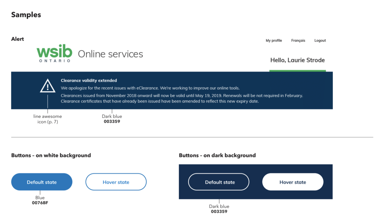
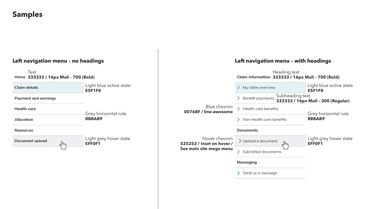
In order to improve the existing WSIB design system, it was important for me to review the existing components and structure. I found pros and cons within the system and created improvements to expand upon this system.
Note: I’ve provided the WSIB design system below for reference
Current WSIB design system
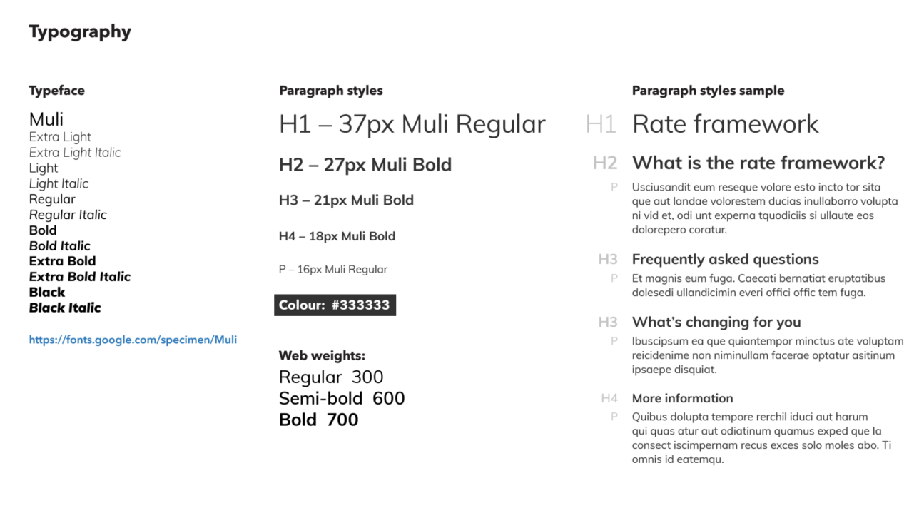
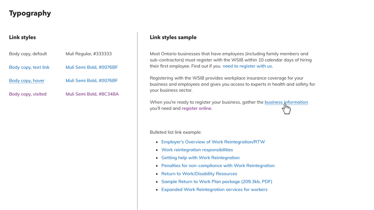
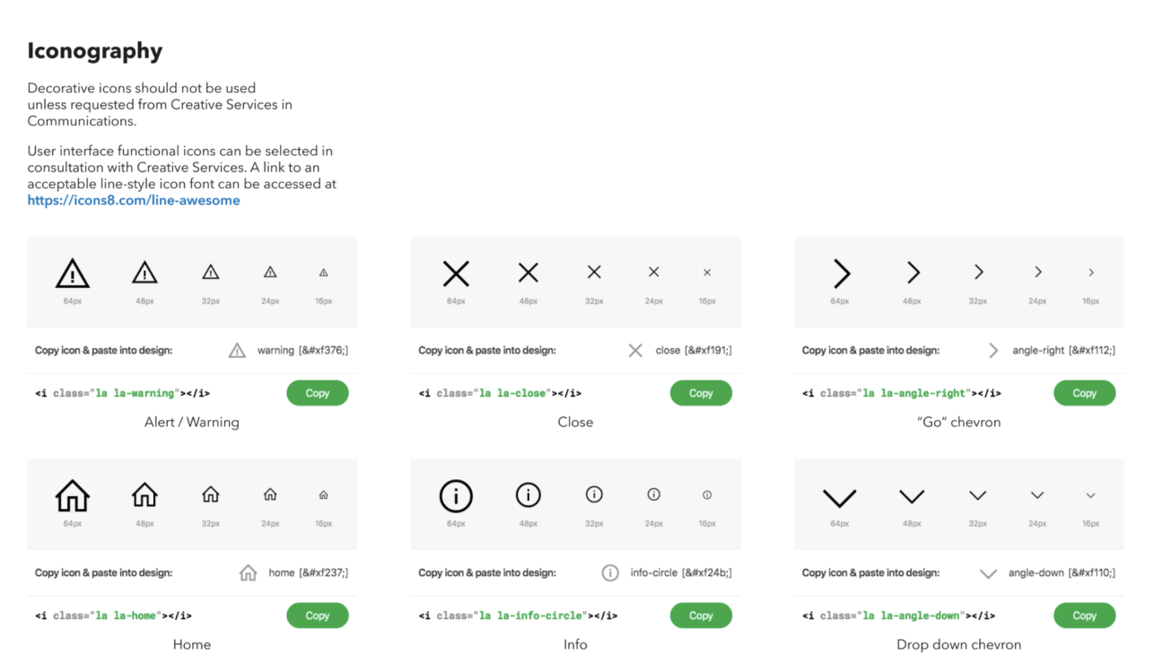
Reviewing WSIB design system
Pro’s 👍🏽
The iconography library used is ‘Line Awesome’ which is thorough and well built out for line icons
Con’s 👎🏽
No clear guidelines for spacing and layout grids
No component guidelines besides buttons (lack of different focus states)
Typography poorly built does not include letter spacing and subtitle, caption guidelines
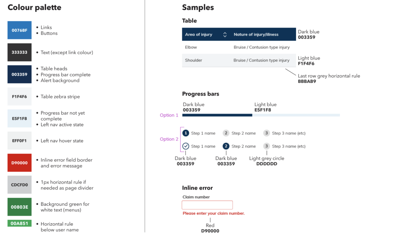
The color palette is not well built-out and lacks structure (lack of primary color palette, progressive greyscale, etc.)
Improvements 📈
Better organization for the design system in key sections such as (Layout, Navigation, Typography, Color, Iconography, and Components)
Expand upon color palette with primary and alert colors and ensure WCAG 2.0 requirements are met
Expand upon typography by including more web weights, line spacing, and capital casing guidelines
Include more components such as navbars and banners
STEP 5
audit components for all projects
In order to improve to create a design system that caters to all WSIB projects and caters to all use cases, it was essential to audit components existing components used throughout different WSIB Innovation Lab products.
Insights 💭
Through this audit, the need for a design system was validated as there was a clear lack of consistency across all the experiences we were creating.
This visual representation allowed me to view all the design inconsistencies and gain a better understanding of which components are used most often - to inform my decisions when creating the design system
STEP 6
review industry designs
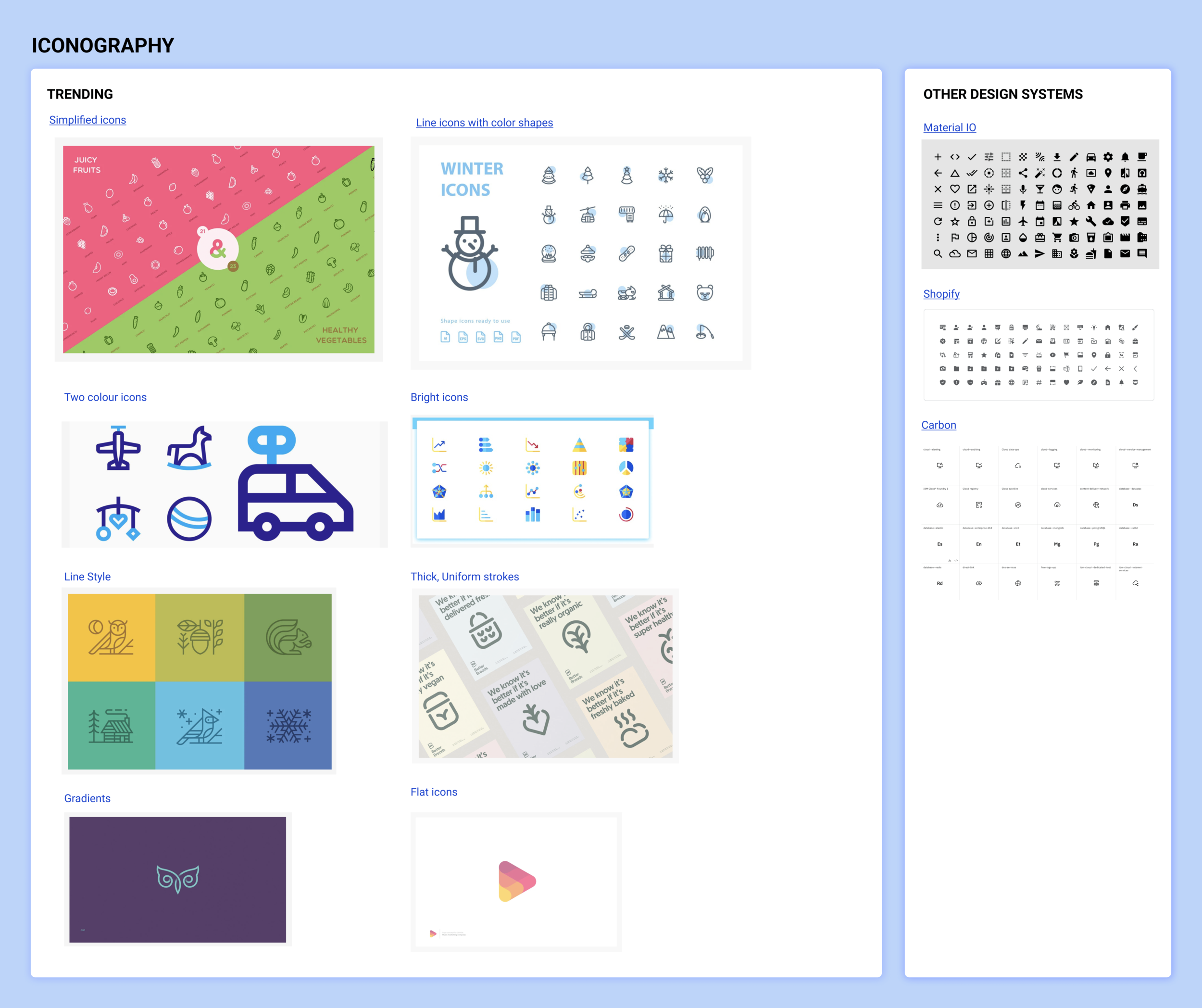
To inspire the Innovation lab design system, I decided to create 3 mood boards for Typography, Color, and Iconography with current design trends and information on how other popular design systems tackle these areas.

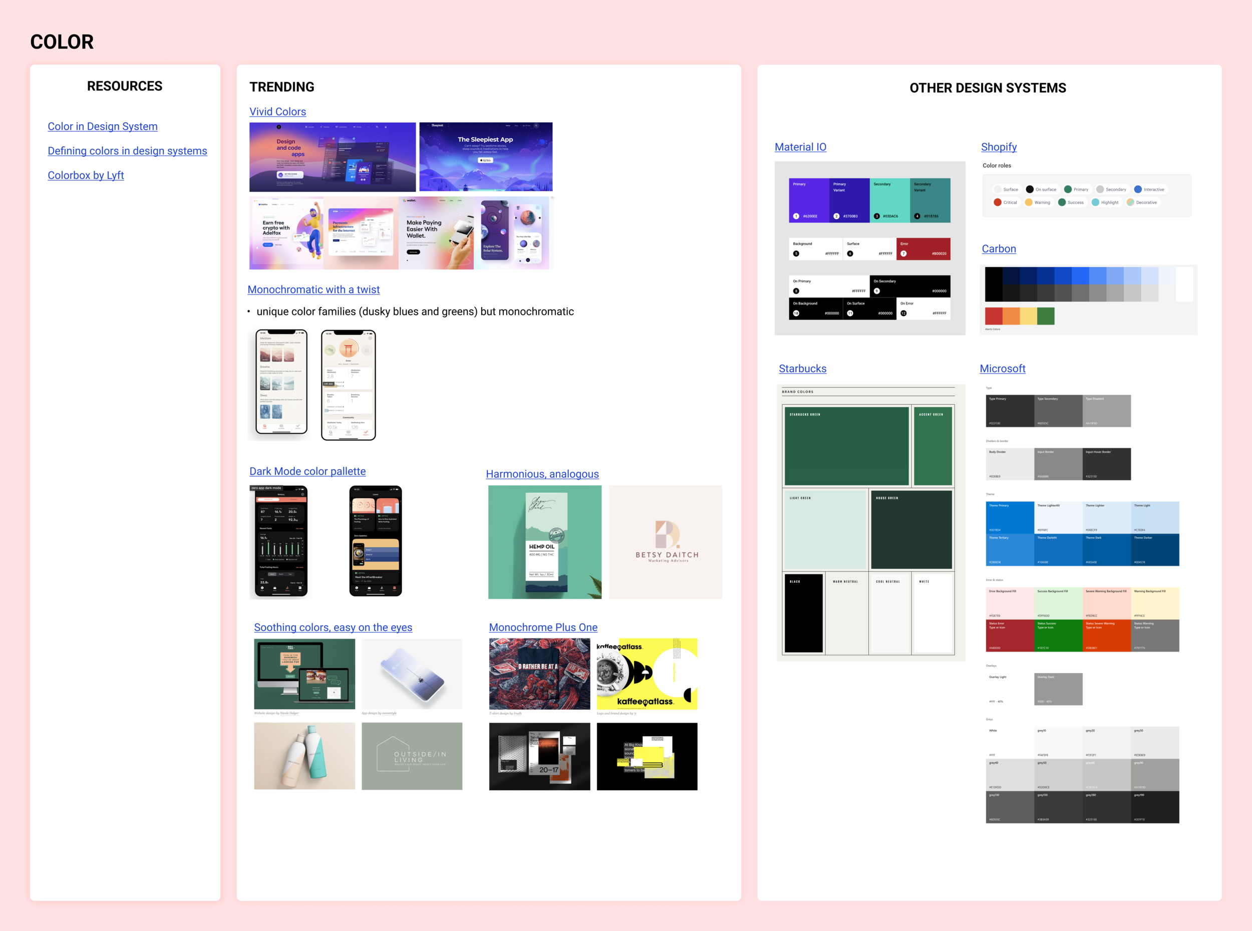
Insights 💭
Through these mood boards, I gained a stronger understanding of current design trends such as vivid color palettes, minimalist fonts, humanistic fonts, and filled icons. All of which helped inspire me and informed the design decisions when creating the Innovation Lab Design System.
STEP 8
build! build! build!
After many iterations of the design system elements, following are the chosen designs.
Innovation lab design system
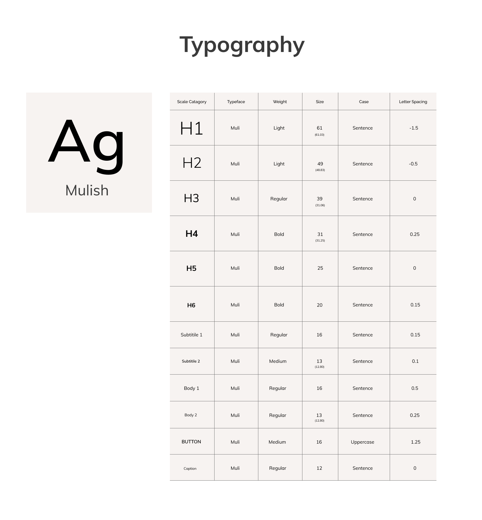
Font
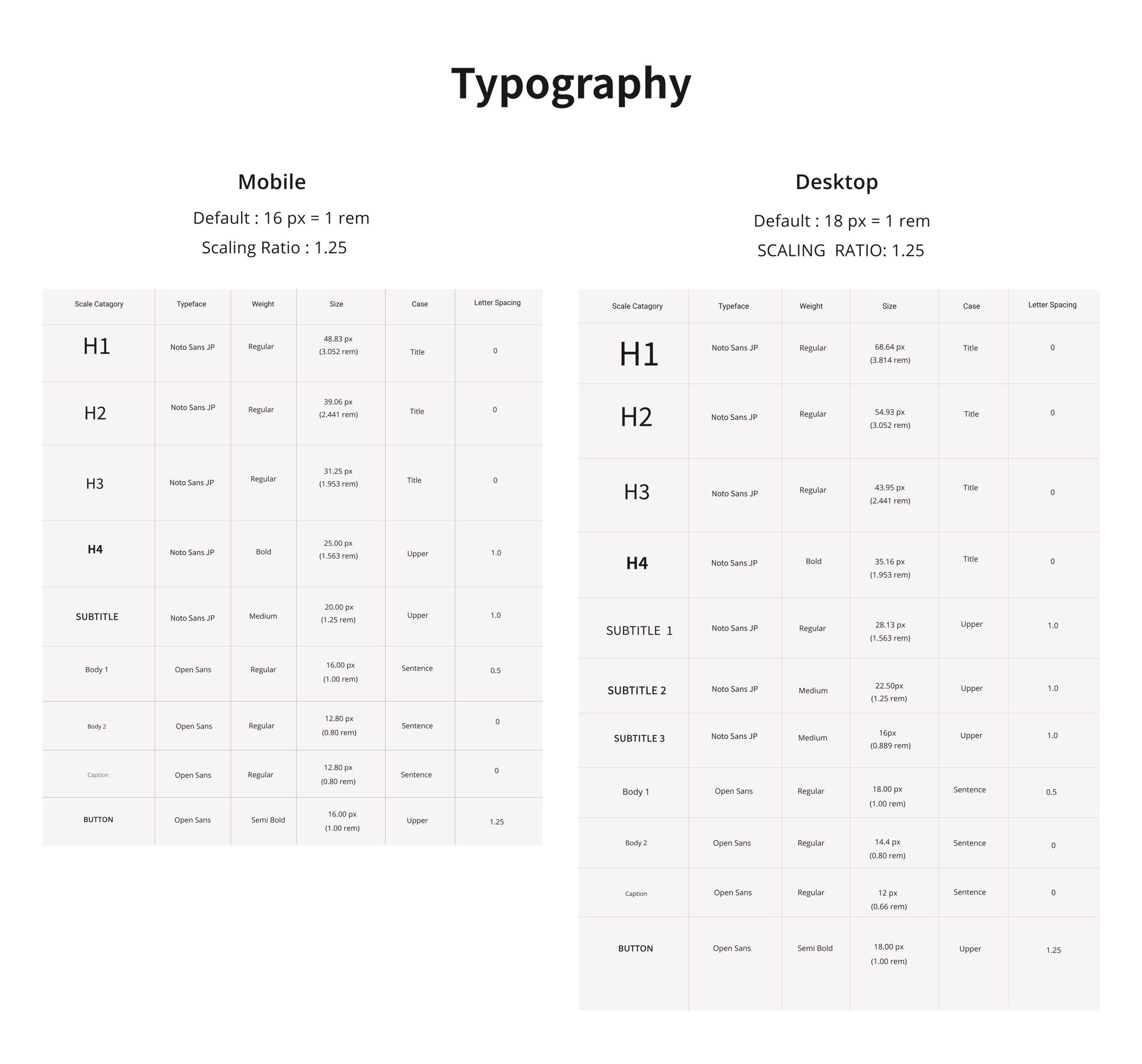
I picked Open Sans for body text and Noto Sans JP as they are both sans serif fonts that are most recommended for products in the mental health sector as they convey friendliness and comfort. Furthermore, they are accessible as they avoid imposter letter shapes, mirroring, have distinguishable characters, and are familiar fonts.
Sizing
To create these versions I used modular scaling and the same scaling ratio for both breakpoints and different base fonts for each breakpoint. I used a major third scaling ratio of 1.25 as WSIB content is usually more catered towards websites and dashboards and a lower scaling ratio is better suited. In terms of base fonts, I used the standard 16 px for Mobile, however, I used 18 px for Desktop to increase readability and better meet accessibility requirements.
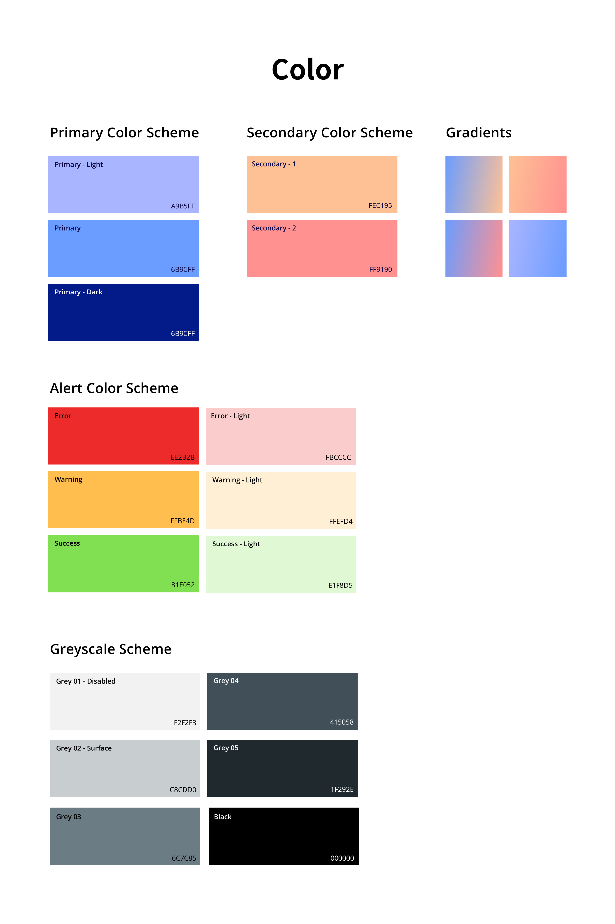
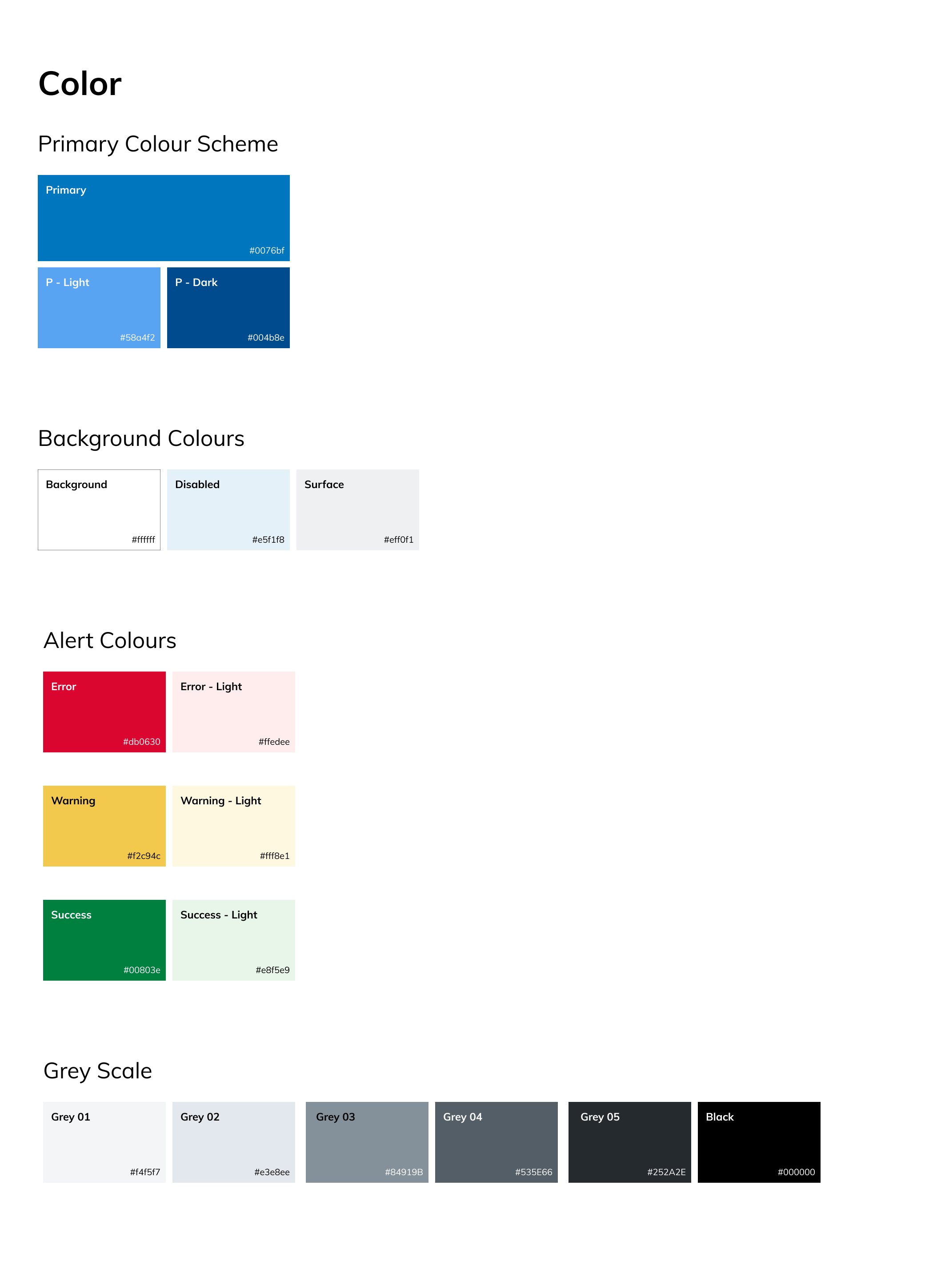
Primary color scheme
It was vital to have a primary color scheme with light and dark variants to build robust designs. I used a purple/blue scheme because these tones bring feelings of calm, serenity, and balance. Furthermore, leveraging pastel color tints to follow current design trends and allow the design system to feel modern and new.
Secondary color scheme
For this scheme, I was inspired by the vivid colors design trends explored in the mood board. I included a salmon and a light orange both of which invoke feelings of excitement and confidence.
Alert color scheme
Having alert colors is vital for communicating key messages. I added a light version for the alert colors to allow for flexibility and allow designers to create a softer alert
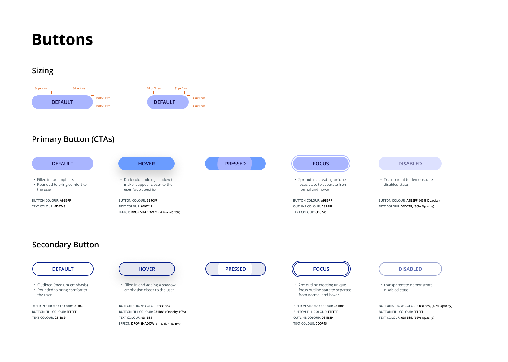
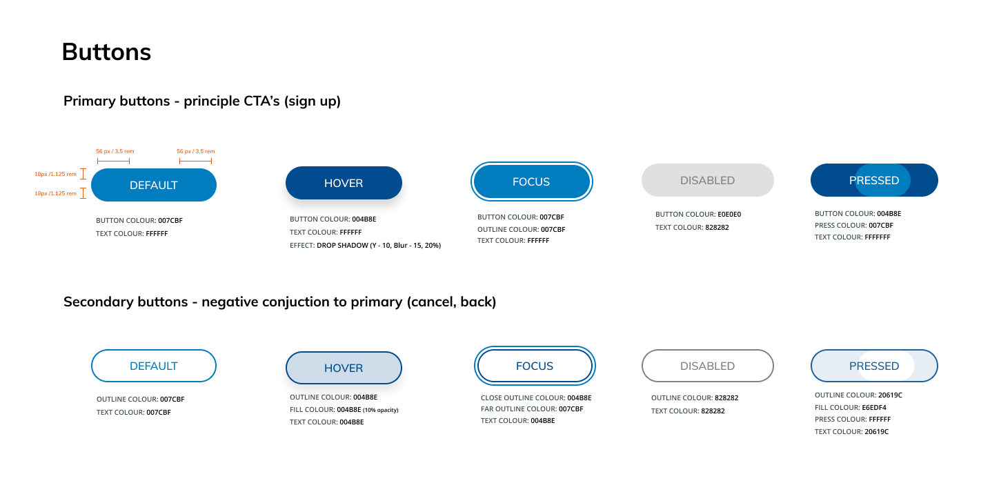
Buttons
I created two sizes; one being regular and one being a smaller version to allow for more flexibility when creating designs and to cater to different device breakpoints.
The buttons have multiple focus states to ensure the buttons are accessible. When designing different focus states, it was vital to have multiple visual indicators and ensure all states are unique - while ensuring the focus states remain familiar from the users' preexisting knowledge so they don't have to learn new interactions.
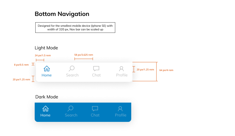
Bottom Navigation
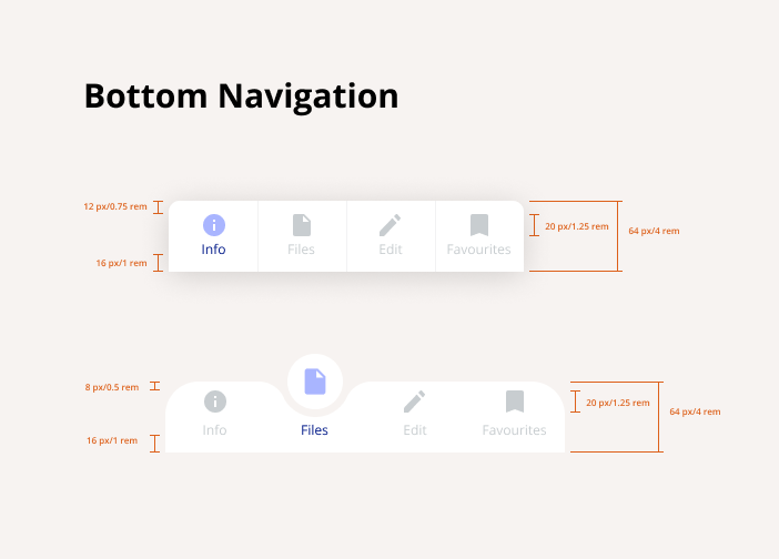
When designing the bottom navigation, I wanted to utilize current design trends and to ensure our Innovation Lab Design System remains modern and fresh. Therefore, I created an active state with a curved swoop effect which is visually appealing and grabs the users’ attention. Rounded edges are used as they provide comfort to the user.
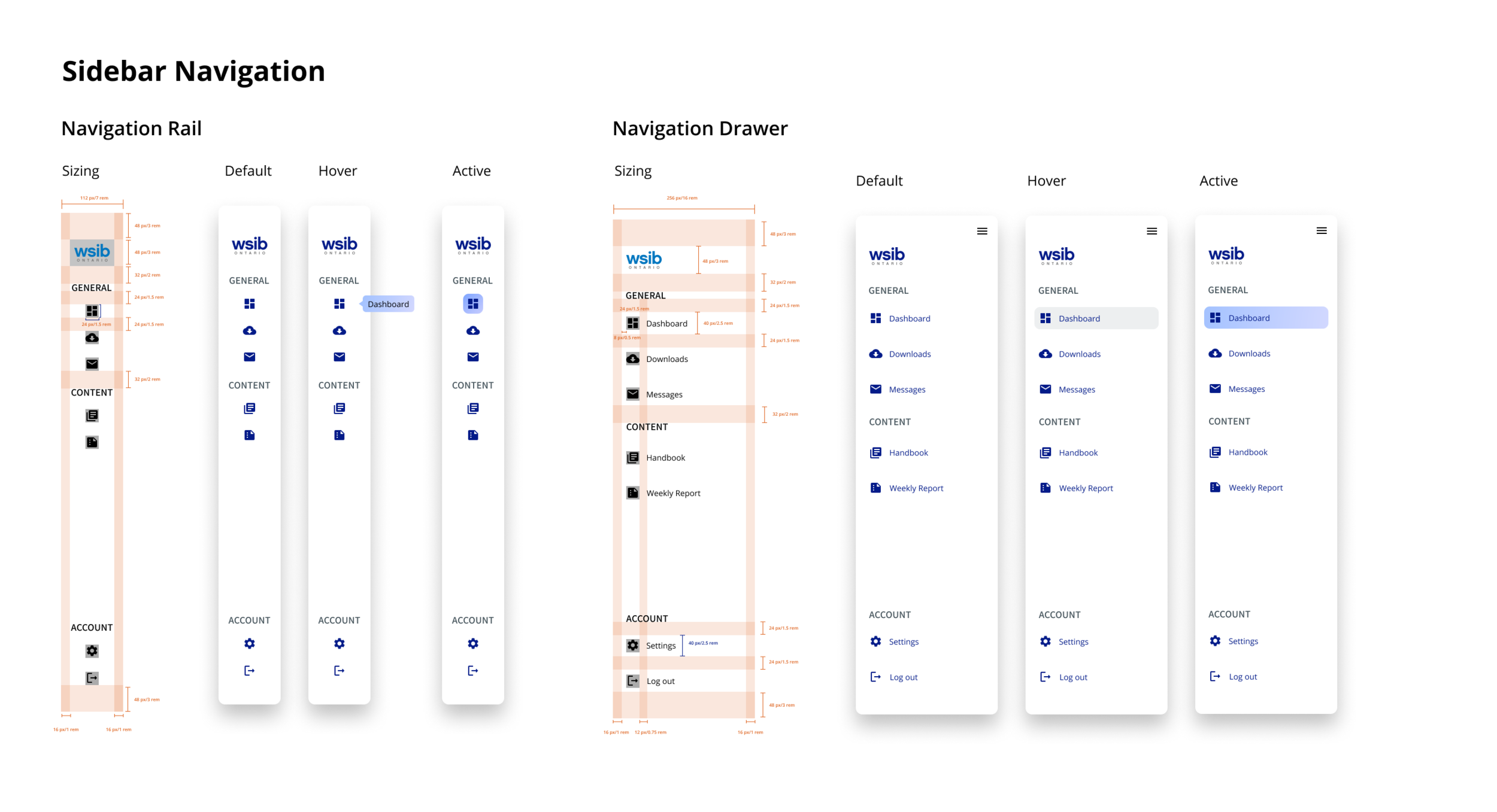
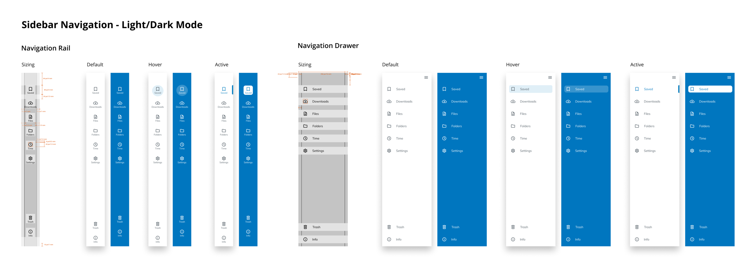
Sidebar Navigation
I created both a navigation rail and a navigation drawer which can be used separately or combined for seamless transitions. Within the navigation bars, I added headers for different sections to increase clarity. I created a hover and active state to ensure the component is accessible.
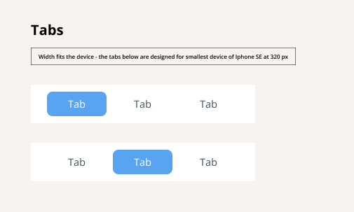
Tabs
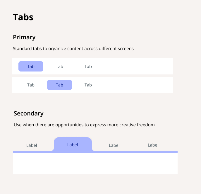
I created two versions to allow for flexibility and more options when creating designs with different needs. The secondary style is more unique and trendy, however, it was important f include a Primary version for situations where there would be multiple tabs throughout many pages.
Text fields
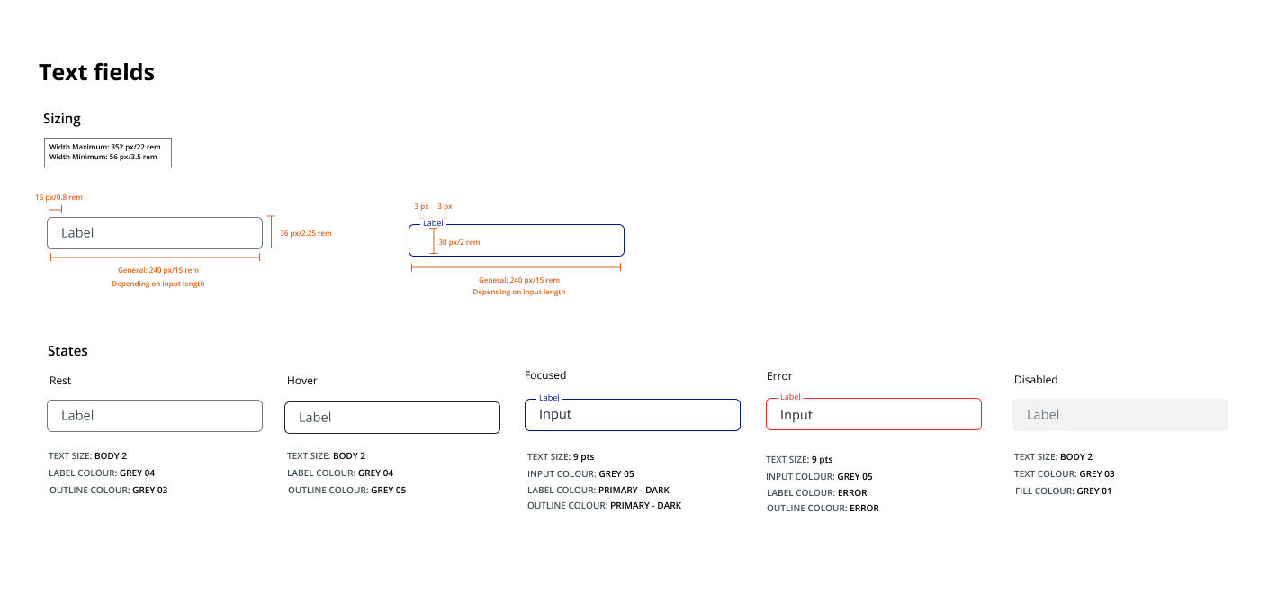
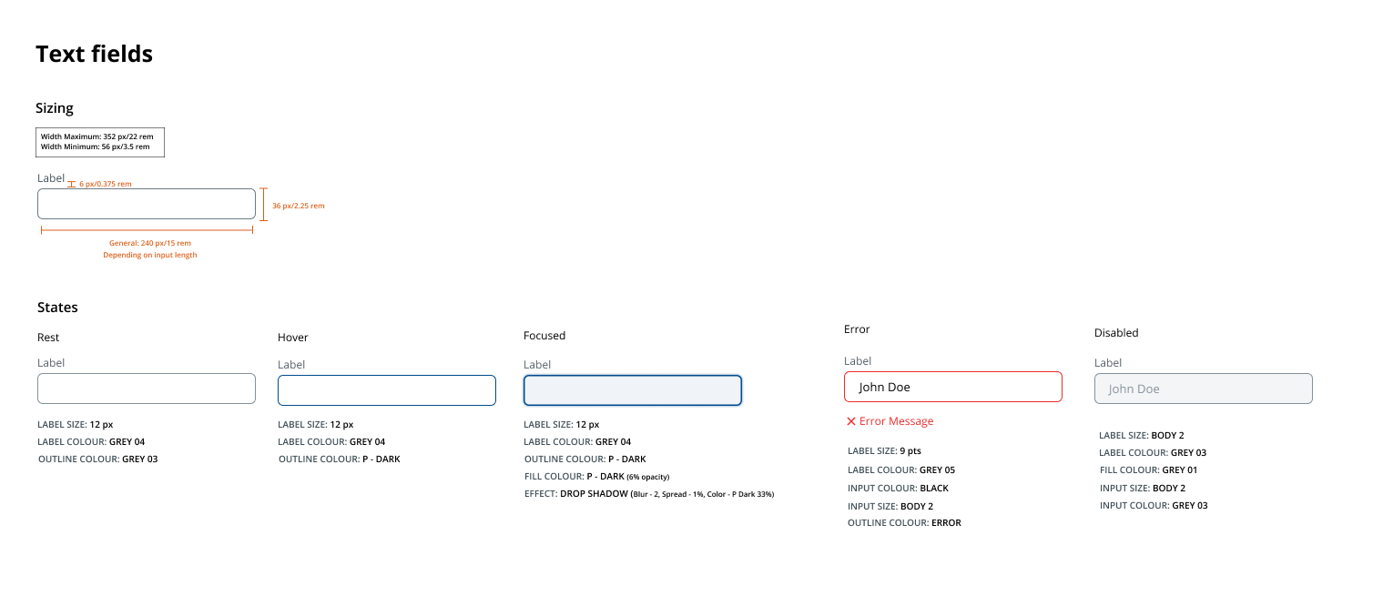
Being a simple component inherently, I didn’t want to overcomplicate and compromise its usability. Therefore I made a simple design and ensured that the label is always present throughout different focus states keeping accessibility in mind.
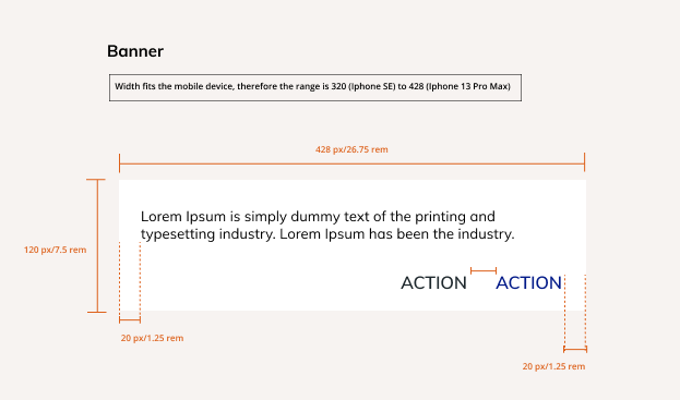
Banner
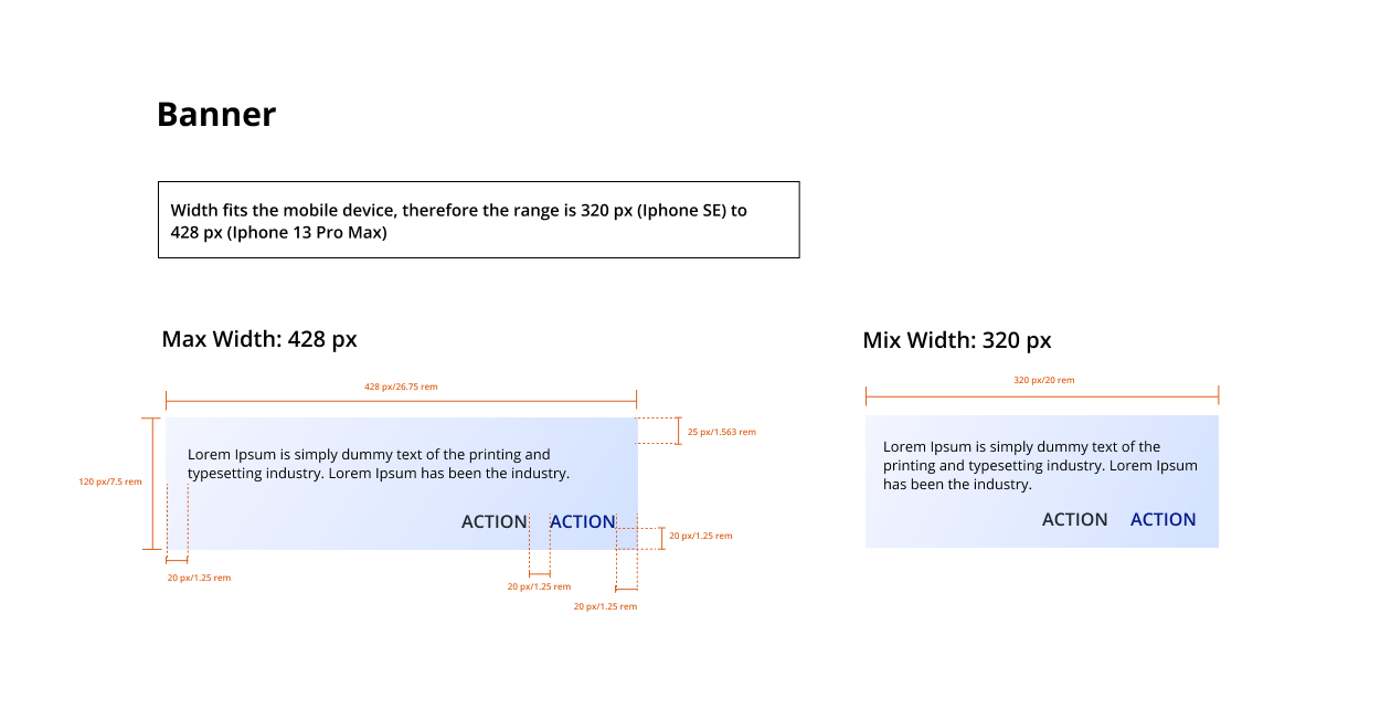
For banners, I initially used the small buttons created before but then I realized they aren’t suitable for small banner sizes, and cause the banners to look cluttered. Therefore, I opted for text buttons. Reflecting on this, I would add text buttons to the button components to establish key details.
WSIB enhanced design system
For the enhanced design system, a very similar process was followed but instead of creating some styles from scratch we modified and added more details to the existing WSIB design system. Therefore, instead of boring you with similar content, you can view the WSIB Enhanced Design System below.


next steps for the team 🪜
Design the remaining 7 components from the component list the design team had already defined
Review the entire design system and ensure it is cohesive and is responsive (consider doing a feedback session with developers, communication staff and leads in the Lab)
Once elements are finalized begin designing mockups to showcase the elements and ensure everything is organized and easy to access
key learnings ⛳️
Designing for Mental health —
Throughout this process, I did research on best practices when designing for Mental health and accessibility allowing me to become an inclusive designer. I learned how to choose the best typeface, the impact of different colors on the users and how the design of individual components will continue to research this space and ensure my designs are catered toward all audiences.
Optimal sizing principles —
When creating typography guidelines and designing different components, I researched optimal sizing to meet touch targets and accessibility requirements. I learned the extensive research that goes into sizing different components especially for responsive design to ensure the designs are streamlined across different devices.
I spent too much time converting from dp, dpi , and px :’)


